A Header component can be used at the top of a Page or can be used to break up content within any Page. It is one of the most popular components among Beezer members (and most loved as well).
The CONTENT tab allows you to set a Title and Subtitle for your Header component. Either of these is optional and could be left blank.
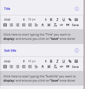
Note: Remember to click on the "Save" option once Header and Subtitle sections are updated.
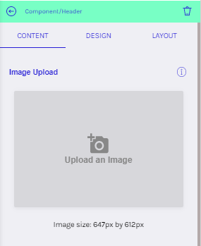
If you wish to upload an image, GIF or an MP4 video to appear as the background of the Header component, you can do so by clicking "Upload an Image" under the Image Upload section.
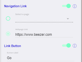
You can add an optional Navigation Link which allows users to click on the Header area and navigate to a Page you have created within your app or to an external webpage. The navigation link can be the entire header area or nested in a button on the header.
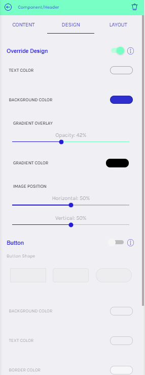
The DESIGN tab can be used to override the default design of the Header component. You can set the desired colours, image position and button styles.
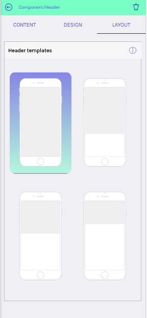
Header Components come in 4 sizes which you can select in the LAYOUT tab. The smallest of these sizes are great for adding text to the top of a page.
Below are a few examples of the header component usage:
https://tedxglasgow.beezer.com/meet%20the%20speakers
https://eduapp.beezer.com/search-courses