Components allow you to add functionality to your app, for example using a Text Component to add Text or a YouTube Component to embed a YouTube video.
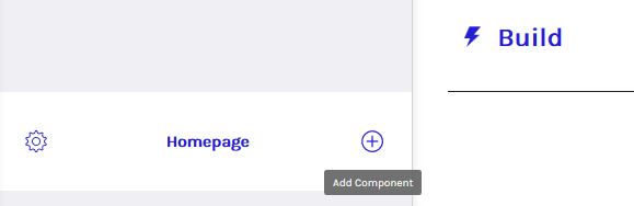
Components can be added to a Page using the + Symbol at the top right of a page.
You will then be able to view all of the Components and add the chosen components to the Page.

Components can be re-ordered on the Page by dragging and dropping into the desired order.
Components can be configured using the CONTENT, DESIGN and LAYOUT tabs that appear when clicking on a Component.
- CONTENT is used for Text, Images and Links.
- DESIGN is used for Colours and Styles.
- LAYOUT is used for the overall layout of the component.
Note: some components have all 3 CONTENT, DESIGN and LAYOUT tabs and others will have only 1 or 2 dependent on the capability provided.