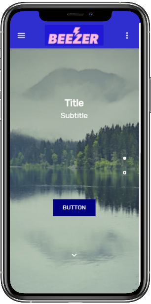
The Slider Component can be used to produce a Vertical Carousel of images into your App where users can slide up and down to view the content. On each slide of the slider, you can add images, text, buttons and links.

Users can navigate by sliding, using the selection icons on the right or by clicking the up and down arrows.
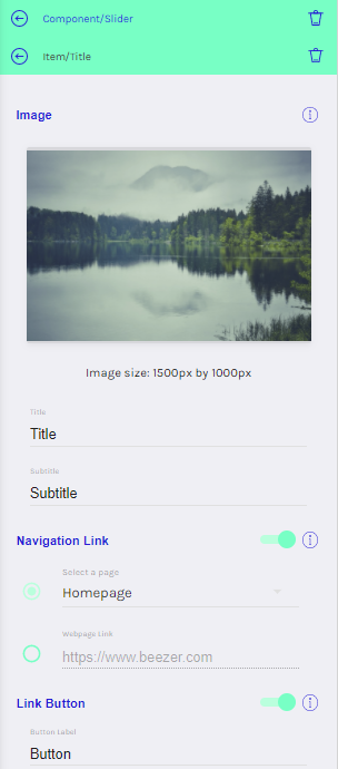
You can add, delete and re-order slides in the CONTENT tab of the editor. If you click on a slide, you can edit the Image, Title, Subtitle, Navigation Link and hide or show a Link Button.
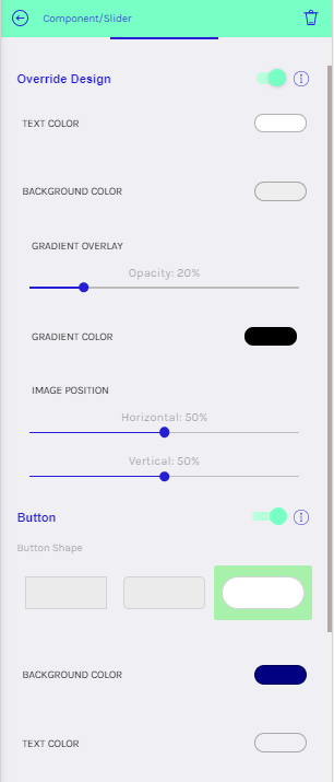
In the DESIGN tab, you can choose to override the default colours and styles which will appear on every slide of the Slider Component.